ACCENTURE
Redesign of the historic tour organiser's website
Review of the website navigation and homepage
CONTEXT
Viaggi Avventure nel mondo is an Italian tour
organiser with almost a 50-year history and hundreds of tours offered around the globe.
Their website certainly is an important tool
in marketing and selling their products, that
however, definitely needs a refresh from
usability and consistency point of view.
This redesign is my personal study project.
CHALLENGE
How can I re-organise the website's navigation and homepage so that it would be user-friendly, and offer a consistent look and feel to strengthen the brand identity?
MY ROLE
UX/UI Design, User research
TOOLS

Research Phase
• Analysis and reorganisation of the Information Architecture of the existing website
• Heuristic Analysis
• Benchmarking
• Mapping of User journey as-is and to-be
• Heuristic Analysis
• Benchmarking
• Mapping of User journey as-is and to-be
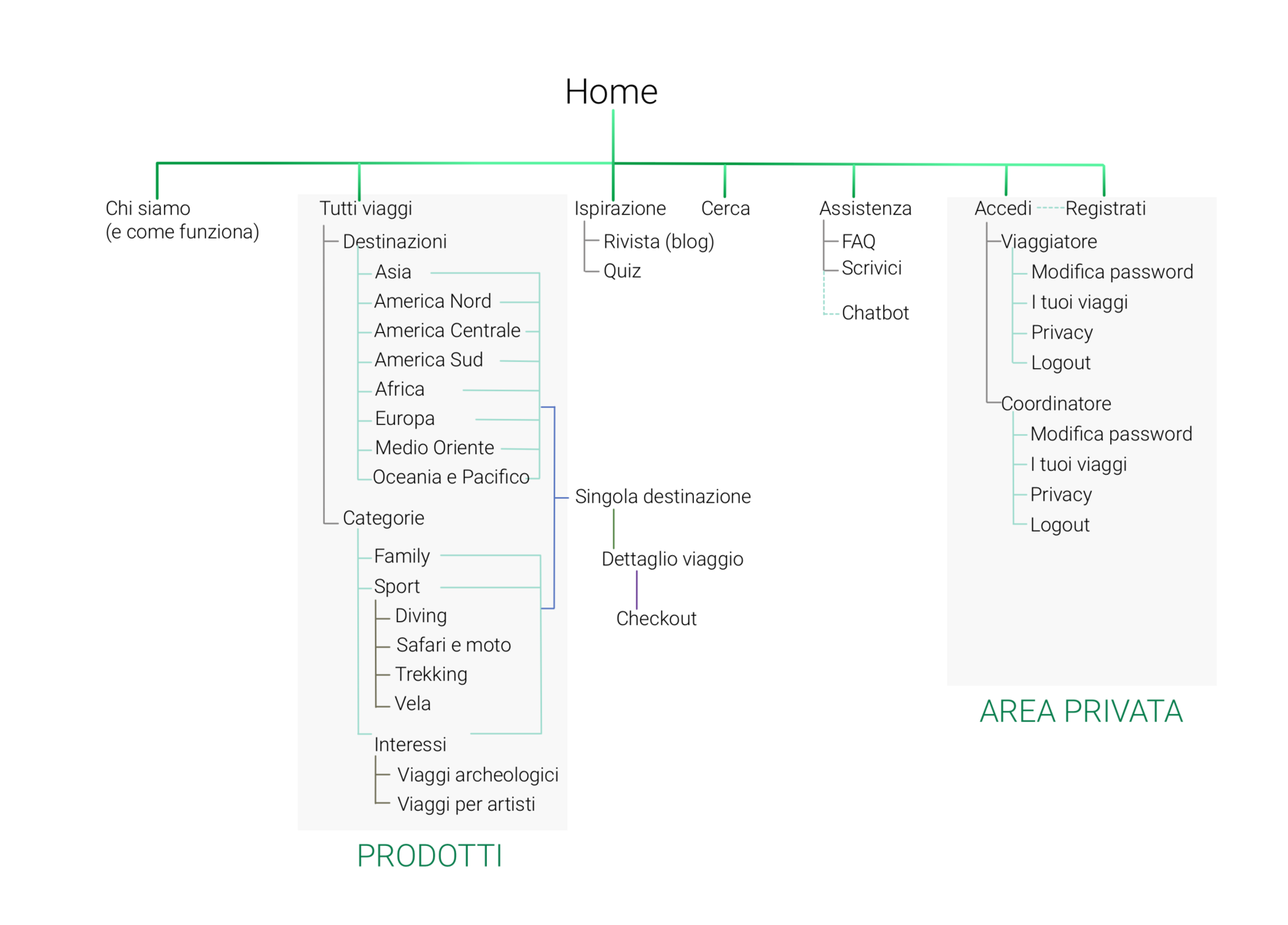
1. Reorganising the site architecture
I started off mapping the existing Information Architecture to catalog all the main areas to then proceed with simplifying the overall site structure and making navigation instantly clear.
INFORMATION ARCHITECTURE
Information Achitecture To-Be
2. Identifying pain points
Choosing a trip can be a time-consuming and overwhelming activity, especially if the website's essential flows, such as checkout, and features like search and filter are not functioning correctly, and overall content is poorly organised.
The existing website does not comply with the latest usability standards, and hardly can satisfy customers' need for multiple parameter search.
Based on 10 Nielsen's heuristics, the following major improvement macro-areas were identified:
The existing website does not comply with the latest usability standards, and hardly can satisfy customers' need for multiple parameter search.
Based on 10 Nielsen's heuristics, the following major improvement macro-areas were identified:
HEURISTIC ANALYSIS
1.
3.
4.
Long error-prone checkout process
Over-complicated navigation and filters
Lack of consistency and standards, both in flows logic and design
Lack of assistance and feedback features
2.
3. Understanding the users and finding gaps for improvement
During the research two macro-personas were identified:
• the users who have a more or less precise idea about the destination and activity type they want for their holiday;
• the customers who search for inspiration.
Mapping User journey allowed to better empathise and understand the users' decision-making process, identify the pain points and opportunities for providing a smooth and intuitive experience.
USER JOURNEY


Design Phase
• Definition of the Design Pillars
• Wireframing
• Visual design
• Wireframing
• Visual design
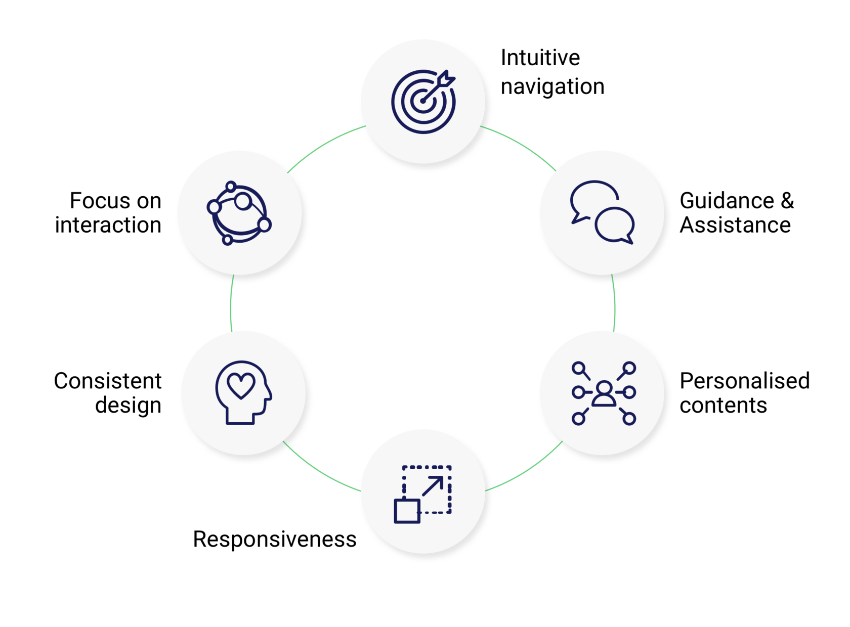
4. Defining major improvement areas
The research results laid the foundation for identifying design pillars and features insights for the further redesign activities on the website.
DESIGN PILLARS
5. In search for viable solutions
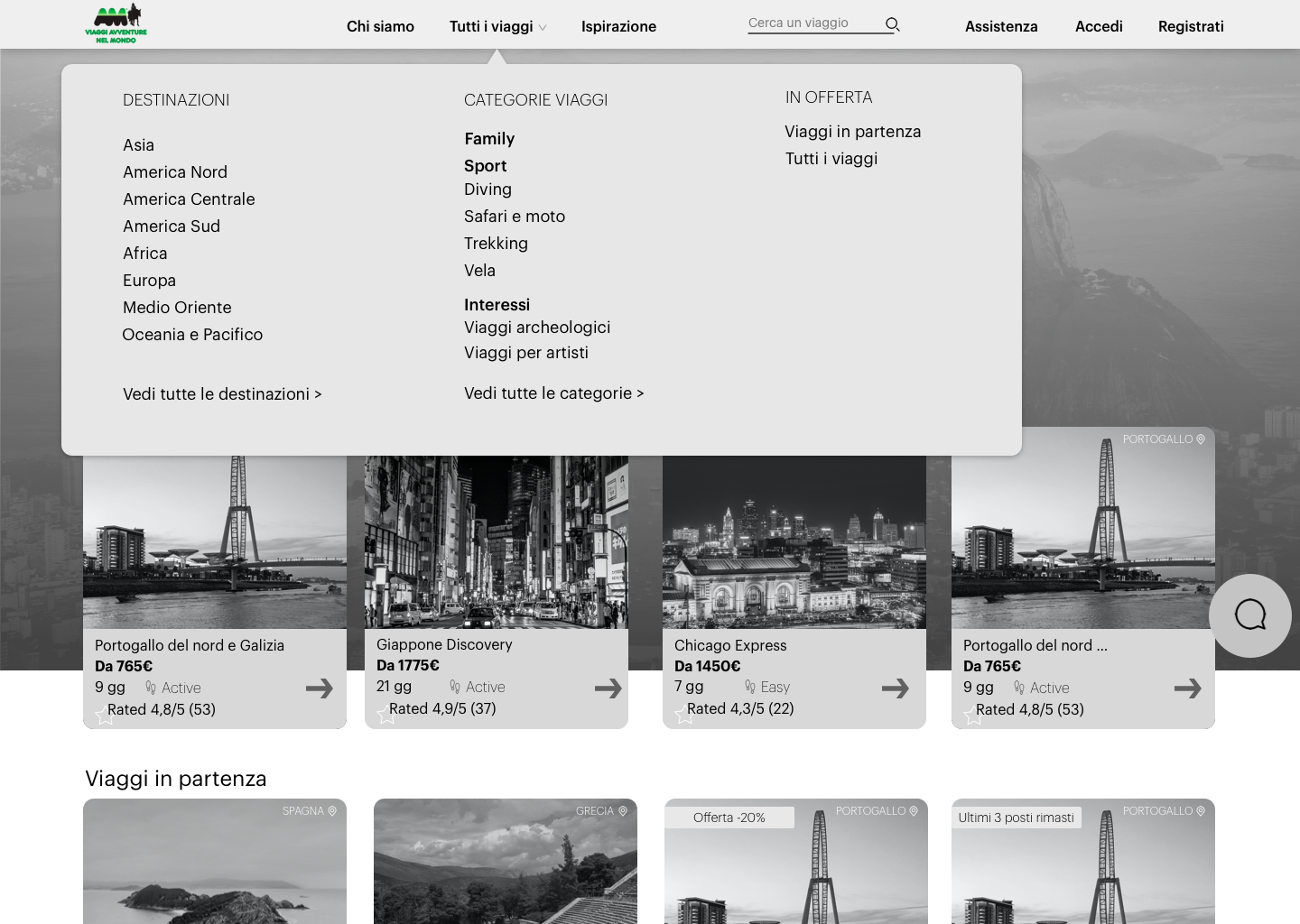
At this stage I needed to ensure how the navigation flow would work and be intuitive on different pages.
When wireframing I usually start with simple pen and paper, and then go on prototyping with Sketch or Figma, use Illustrator and Photoshop for visual design details.
When wireframing I usually start with simple pen and paper, and then go on prototyping with Sketch or Figma, use Illustrator and Photoshop for visual design details.
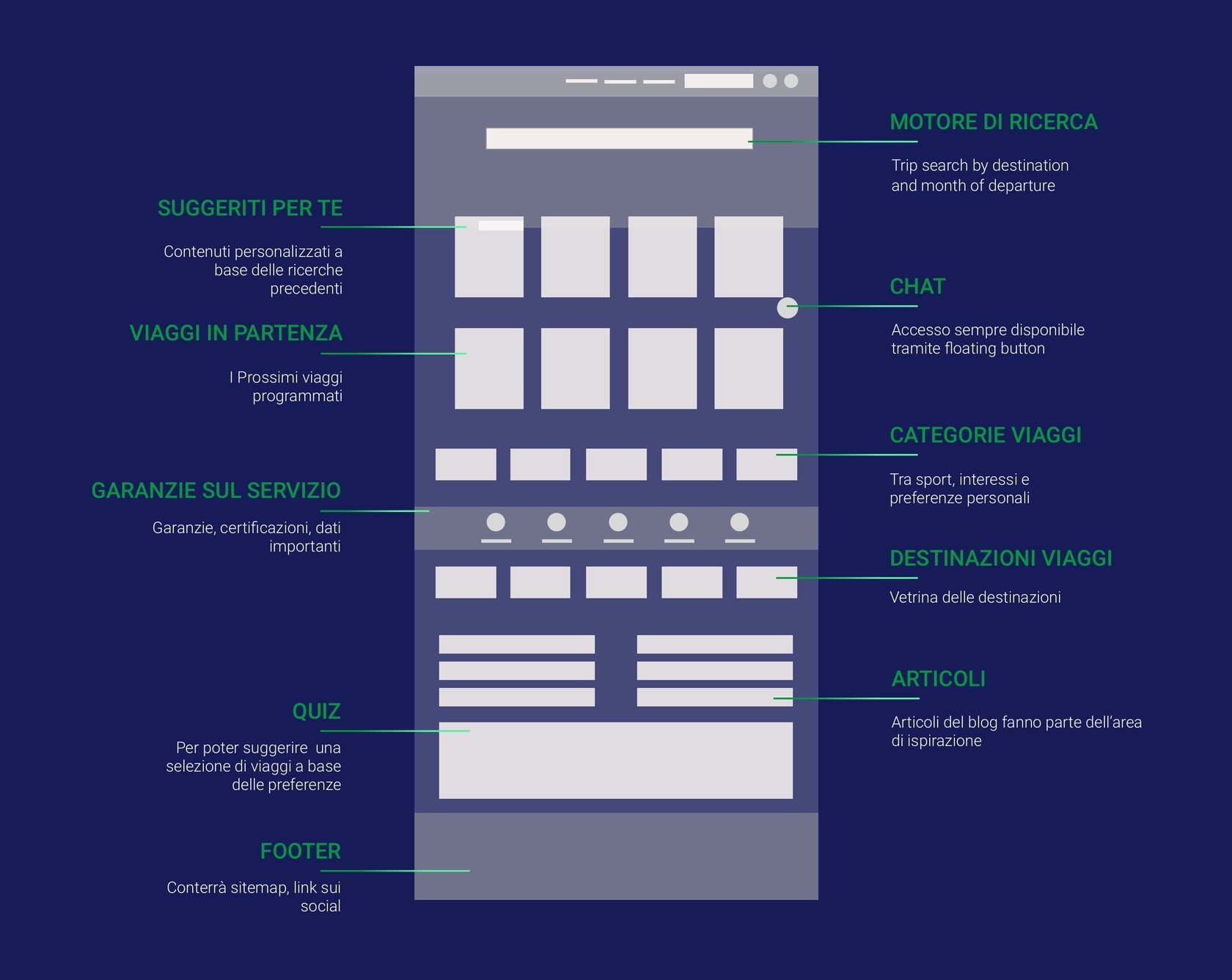
WIREFRAMING
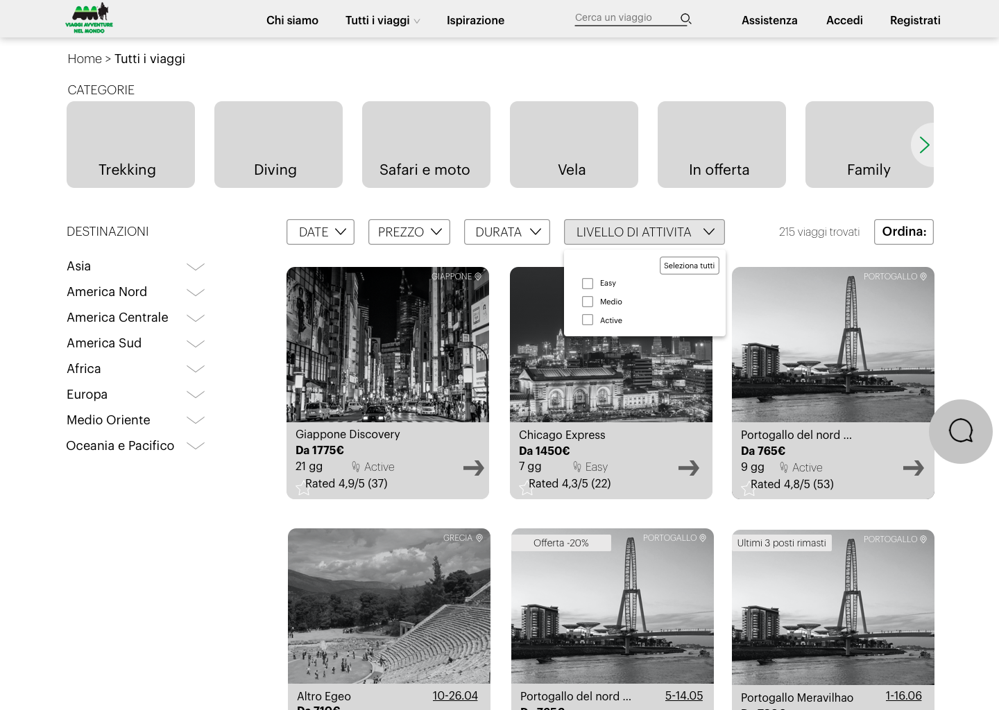
6. Focus on Homepage
As of this project's scope, I further focused on the Visual design of the Homepage. The challenge was to present in the most accessible way the extensive trip catalogue Viaggi Adventure boasts of.
WIREFRAMING

The main goal for this project was to reorganise the whole structure and content hierarchy, while keeping the logic areas and catalogue, and create a consistent visual design.
The layout of the Homepage provides an immediate access to the main areas defined in the Information Architecture, and organised with the hierarchy based on the users' needs and with the focus on content personalisation.
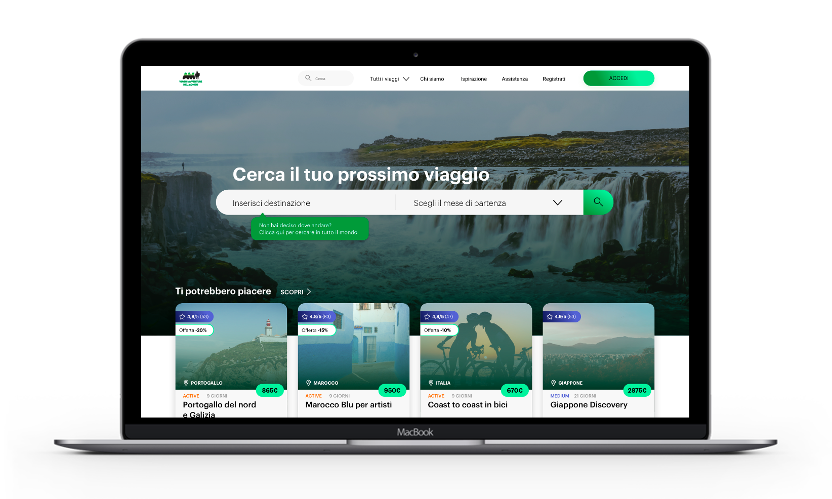
In the Homepage users can find the search with macro filters, a variety of trip categories, grouped by activity type and macro-destinations, service guarantees banner, the area dedicated to the inspiration phase: quiz and articles.
7. Result
PROTOTYPE
8. Usable and useful
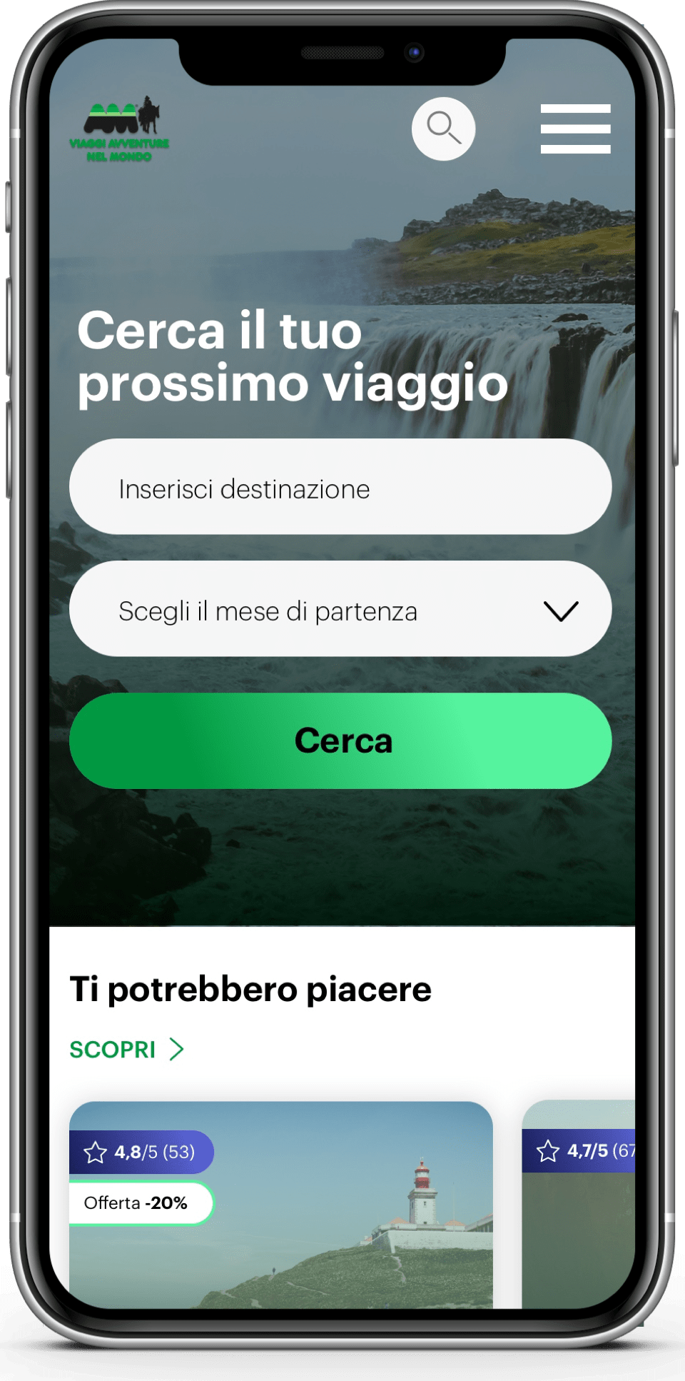
A redesign is always an exciting challenge. This case study allowed me to make the whole way through the design process on my own: from simplifying the site architecture and hierarchically organising content to further working on visual design. Making design that simplifies experiences, anticipates needs, engages, and is delightful for the eyes helps to see the bigger picture during the process. And certainly, consider site responsiveness.
TAKEAWAYS
Previous
Customer ratings & reviews project
Designing reviews collection and visualization flows from scratch